Friday, April 19, 2013

Float


My inspiration was to capture the wild and spontaneous nature. The technical challenges i had with this picture were what height to make the camera and I somewhat resolved the issue with trying different angles. The artist challnges were getting my models to do creative things and i overcame it by helping them and giving them ideas.

 For this picture i didnt really have an inspiration but once it was taken it made a lighthearted fun atmosphere. They amost look like they are floating too which is pretty good for the project. The technical challenges were the shadows, trying to get the shadows in the picture to help the allusion. The artist challenges were getting them to run and jump at the same time but i worked out well in the end cause they cooperated good.

 For this picture my inspiration was obviously levitation, magic, making it look real and unreal at the same time. Some technial challenges were making the background picture match the original exactly. Which it didnt but i ended up fixing it in photoshop. And also the original shadow was making the ground darker and it was lighter in the background picture. The artist challenge i faced was getting my model in a position to where when i removed the chair it actually looked like she was realistically floating. And i overcame it by geting her to make a good position.
 

Wednesday, March 27, 2013

Poses

Environmental

 When i took this i was near the Q hut on a hill. A difficulty i had with taking this picture wasgetting the background to not wash out or be so bright. This image was the best from the ones that i took because of his facial expression and body language, though still not the strongest. This picture could be improved by darkening up the background more and making him more of the focal point.


I took this near the lunch area on a hill. Difficulty i had taking this picture was trying to cut the sky out in the back but still including a lot in the picture. This image was the best out of them all because it has the most character. This picture could be improved upon by taking it with a different bachground with better lighting.

Seated

 I took this picture on the bench near the front office. One difficulty i had with taking this picture was the lighting but i got a sun shade which allowed some light to come through and light his face but not wash it out. This image was the best that i took for this subject because he had good facial expression and the best lighting. It could be improved by taking the picture in an ever shadier place.
 
 
 I took this photo on the grassy hill in front of the main office. A difficulty i had with this picture was the lighting. This one was the best i took out of all because the sun wasnt shining directly on her face so it didnt wash it out. It could be improved by making it darker.
 

Tall

 I took this photo of phuong standing on a bench. One difficulty again was the lighting, the sun made an awkward shadow on his face. But this was the best  one i took bacause there was minimal shaddow. It could be improved by shading him completely so he didnt have shaddows on his face.
 
 
 I took this picture while she was standing on a bench. One difficulty i had with taking this picture was the background and the lighting. This was the best one i took because it created the best aspect of standing tall. It could be improved by getting down lower and not zooming as close.
 

Wall lean

 I took this picture right outside the attendence office. One difficulty i had with taking this picture was not getiing him to be so dark, so i used the reflector to lighten him up some. This was the best one because it has the most personality. One thing that could be improved was the angle of the shot, cause his leg kind of look like its gone.
 
 
 i took this picture in the same place as the last one, right outside the attendence office. One difficulty i had was with the shade but i think i solved it with a reflector. This was the best i think because of her facial expression and the lightness of the picture. One thing that could improve would be how she's leaning on the wall.
 

Wild Card

 I took this picture next to the main office next to the grass. The difficulty was the lighting. This picture was the best cause it was my favorite, his face makes me laugh. One thing that could be improved was the lighting and background, so maybe changing the location.
 
 
i took this picture in front of the office. The one difficulty was the cement washing out wich was very hard to get rid of. This picture was the best i took because of the lighting even though its still really washed out. One thing i could improve would be the background.
 
 
The most challenging element of this assignment was getting my models to make good facial expressions and dealing with the lighting. For the most part i just tried to make them feel comfortable but the lighting was still really  challenge for me.
 
My Photography skills have changed a lot since seprtember. Ive learned a lot of new techinques and become more confident or outgoing and more comfortable working with my peers.
 
Some things i am intersted in learning before the end of the year are controlling my backgrounds and figuring out where to take a picture to make for a better less distracting background and making my picture more interesting. Also dealing with lighting is very hard for me so i'd like to learn how to deal with that when its an issue.


Thursday, January 31, 2013

PhotoAnalysis: Portraits


Theres a puppy in this picture. I see a little green blurry patch that could possibly be a hill of grass. The picture was taken outside. The puppy could be at a park or in a backyard playing. It could be the first time the puppy has ever been to the park and the owner was really excited so they took a cute picture. Why is the puppy outside? Is it really a puppy? Or is it one of those really small dogs?

 
There is a little girl running in this picture. She is outside and its a gloomy day. There is grass. She may be playing with her siblings at the park. Or maybe she's with a babysitter. She's wearing a pretty dress so maybe she's at a fancy event like a wedding or church. She loves playing. She's running from something.  Why is she running? Does she have shoes on? Whats up with the dress?

 
There is couple on this picture, happily married or about to get married. Its sunny outside and they are in a scenic area. They both look very happy to be devoting themselves to each other for the rest of their lives. The wind is blowing. Her veil is flowing off to one side and they're holding hands. They are getting married. They love each other. They are extremely happy. Why are they in a grass field? Are they in the country? Why are they standing a little apart?


There is a young girl kneeling in some weedy grass. She's pulling the hair out of her face and laughing. She looks like she's having fun. She's very happy and its warm outside based on her clothes. Why is she laughing? Where is she at? How old is she?

 
This is Ken Roczen.  He's standing in front of his dirt bike. He's at a dirt track. He's a professional and he's determined. Why is it so gloomy outside? Is his racing color orange?

Saturday, January 26, 2013

MIDTERM Portfolio

Rule of thirds

This photo R  

Fill the Frame


Lines

This photo represents lines. It works best for the assignment because

Angles

This photo represents angles. It's the best example

Pattern


This photo

Framing


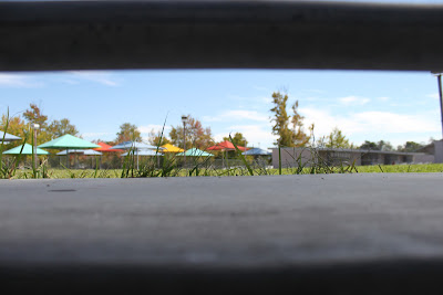
This photo represents framing. It works well because it draws your attention to the colorful umbrellas but also has black frame on the top and bottom. I couldve moved back a bit more so the frame wasnt so black.

Shutter Speed


This photo represents shutter speed. This picture is a the best example for the assignment because you can clearly see the motion thats taking place but its still so clear and not blurry. One thing that i could improve upon with taking this picture would be to not have such a washed out background.

Panning


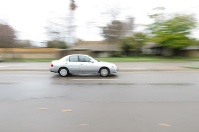
This photo represents panning. Only the car being focused on and clear makes this picture work best for the assignment. One thing i might have done to make it better is to get a different color car to make it more interesting to look at.

Depth of Field

This photo represents depth of field. It works well for the assignment because it creates a visual sense of distance between the flowers and the back and the color is an attention drawer. But one thing i could've done to improve this would be to change my angle and get more of an interesting and not so grey background.

Wildcard

This photo represents depth of field. The well blurred background and clear foreground makes this image best for the assignment. I think this picture could improve if i zoomed in a little more and not included so many flowers.

For each photo answer the following questions:
  • What technique or skill does this photo represent? (i.e. panning, depth of field, rule of thirds, etc.)
  • What qualities of this image make it stand out as your "best" for this assignment?
  • Is there anything that you think would make the image stronger?

  • My biggest challenge in this class would probably be the lighting and what settings to change to improve it. I am in the process of learning how to overcome this problem. Mr. Pedersen can help me by just answering any questions I have that will help me improve upon this problem.
  • My biggest success in this class would have to be depth of field and knowing how to create distance to make the picture look better cause that's one thing I've always been good at. This could definitely help me second semester with the many projects we will be doing and new things to be learning. It could help with focus and blur.
  • I am most interested in learning portraits next because it's something I've always liked to take pictures of cause people give so much emotion and create a really good picture.
  • One thing Mr. Pedersen can do to improve my experience in this class would be continue helping me with any problems or questions I have.
  • One thing I can do to improve my experience in this class would be to go out and take more pictures on my own so when I come back to class I can ask more questions that will help me take better pictures for projects and in general.

Wednesday, January 9, 2013

Depth of Field

This photo has large depth of field. The focal point is the rod leading off into nowhere. This photo demonstrates large depth of field because everything in the image is in perfect focus. I think the photographers purpose was to make you feel lost or make you wonder where exactly that road leads off to.

This photo has shallow depth of field. The focal point is the motocross rider on his bike. This photo demonstrates shallow depth of field because the rider and the mound of dirt he's riding on are in perfect focus and everything in the back is out of focus. I think the photographers purpose was to capture the intensity of the sport.

This photo has a shallow depth of field. The focal point to me could either be the rock with the snow on it or the mountain in the background. This photo demonstrates a shallow depth of field because it focuses on one object in the foreground and blurs out anything in the background. I think the photographers purpose was to creatively show the beauty of nature.

This photo has a large depth of field. The focal point is the big building. This photo demonstrates large depth of field because everything in the photo is in perfect focus and its a large landscape. I think the photographers purpose is to create a beautiful, mysterious and mystical scene.

This photo has shallow depth of field. The focal point is the golden brown dog. This photo demonstrates a shallow depth of field because the gold dogs nose is in perfect focus and the black dog in the back is out of focus. I believe the photographers purpose was to show the seriousness of the dogs.

This photo has large depth of field. The focal point is the mountains and the sand dunes. This photo demonstrates large depth of field because everything is in clear focus. I think the photographers purpose was to show the different elements of the desert cause its not just all sand.

Monday, January 7, 2013

End of the World

 This is my car, her name is lady because she looks like a lady bug and i chose her as one of my three items to save. I chose her because i would obviously need a place to live if the world did completely end. Its good shelter and it could provide good transportation.

 As one of my other items i would choose chips because i have an addiction. Its very bad and i cant live without them. They would keep me nice and plump no doubt if this is all i got to eat which is good for the winter and in the summer i could run it off.


My last item is my dog, lucy aka cookie! She's my best friend, an awesome companion and she would definitely keep me sane. She's so sweet and the best cuddle buddy but she can be feisty too which is always good for protection. She's never left my side and i couldn't live a day without her.

Thursday, December 20, 2012

Panning

One person walking


When i took this picture i was by the library. One problem i had prior to getting this shot was the sun washing out the whole picture so i moved into the shade. This shot was the best representation of the skill because you can tell she's walking and you can see movement without it being blurry. I tried taking the picture in the sun and it was too bright because i had to set the shutter speed lower. This picture could be a bit less blurry.


Vehicle Moving

When i took this picture i was out on the sidewalk in front of school. One problem i had prior to taking this shot was the car not being clear enough. This shot was the best representation because the car was very clear and the background had a lot of blur. It was a good contrast. I tried going slower while panning and it turned out just blurring the whole picture. This picture could be more zoomed in.

One person running

when i took this picture i was by the library. A problem i had was not panning fast enough and making her really blurry. This shot was the best representation because you can clearly see her and can tell she's running. I tried a higher shutter speed and it didnt capture her clear enough. The background is really washed out.

Vehicle moving #2


When i took this picture i was out in front of school by the street.
One problem i had prior to this shot was not enough blur in the background and not showing movement. This shot was the best representation because its perfectly zoomed in and clear and the background is blurred out, showing motion. I tried setting the shutter speed lower and it blurred everything.The whole picture is really white, it could be darker.